Insights Hub
Unlock a World of Knowledge at Encora’s Insights Hub
Don't miss out on any insight. Subscribe to stay in the loop about our exclusive content.

Learn More

If you've ever watched Hollywood's take on the ...
Learn More

Generative AI is revolutionizing many aspects of ...
Learn More

Building upon the previous article, to fulfill ...
Learn More

A Point of View on How Loyalty in Travel Could ...
Learn More

E-commerce has revolutionized how we shop, ...
Learn More

Organizations are in constant need of practices ...
Learn More

The Ethereum blockchain has been at the forefront ...
Learn More

This article was published for StarlingX you can ...
Learn More

In the article Fine-Tuning Large Language Models, ...
Learn More

Fine-tuning, a transformative process in the ...
Learn More

This is the third article in a series that ...
Learn More

The Imperative for Unified Commerce and ...
Learn More

Recent worldwide studies are mapping the UX ...
Learn More

Health data availability has been growing ...
Learn More
The Ethereum blockchain has been at the forefront ...
Learn More

Learn to prototype using impactMapping and ...
Learn More

Fraud has grown in several verticals in recent ...
Learn More

In this webinar, we'll explore how you can ...
Learn More

This study focuses on regional differences ...
Learn More

In this webinar, we provide an overview of the ...
Learn More

In this webinar, we discuss best practices and ...
Learn More

Learn More

The Metaverse is the experiential (re)evolution ...
Learn More

Blockchain' is one of the current "buzz" words ...
Learn More

Jetpack Compose, based on Declarative UI, uses ...
Learn More
Smart Contracts are a promising application of ...
Learn More

Image generation tools such as Dall-E have ...
Learn More

Cloud Service Providers offer a wide range of ...
Learn More
Computational Mathematics involves leveraging ...
Learn More
Mobile apps have become the default option for ...
Learn More

When designing products or services, designers ...
Learn More

The path to achieving modernization is not always ...
Learn More
In an era In today's rapidly evolving software ...
Learn More

In an era where user experience dictates product ...
Learn More

We will provide an overview of the importance of ...
Learn More

Gain valuable insights into leveraging AI in ...
Learn More

This webinar explains how industry leaders can ...
Learn More
Explore the transformative impact of generative ...
Learn More

Our previous article explored how banks can use ...
Learn More

Every year, the number of web accessibility ...
Learn More

Have you ever wondered how the first Virtual ...
Learn More

The Ethereum blockchain has been at the forefront ...
Learn More
In the ever-evolving landscape of software ...
Learn More
Every year, the number of web accessibility ...
Learn More
“We all are gifted, and that is our inheritance.” ...
Learn More

Unveiling the First Layer: The Business Use Case. ...
Learn More

Safeguarding the lives of pedestrians and drivers ...
Learn More

The media and entertainment industry is in a ...
Learn More

The rapid emergence of generative AI models like ...
Learn More

The emergence of Generation Z in the global ...
Learn More

This article was published on Medium. You can ...
Learn More

Organizations today strongly emphasize ...
Learn More

In our previous Snowflake performance-related ...
Learn More

This article was published for StarlingX you can ...
Learn More

Quality has always been a key aspect of product ...
Learn More

Generative AI platforms have transformed the ...
Learn More

As companies seek to thrive in an increasingly ...
Learn More

Data has taken center stage in the digital era, ...
Learn More

In the ever-evolving landscape of cloud-based ...
Learn More

In a previous article (Efficient API Test ...
Learn More

As businesses grow more dependent on ...
Learn More

Introduction In the digital world, 3D characters ...
Learn More

In the dynamic landscape of healthcare and ...
Learn More

In today's healthcare landscape, Medicaid-focused ...
Learn More

In the dynamic landscape of healthcare and ...
Learn More

In the ever-evolving field of Natural Language ...
Learn More

"Design is not just what it looks like and feels ...
Learn More

Apple’s Vision Pro introduces a paradigm shift in ...
Learn More

GenAI has unleashed a wave of innovation and ...
Learn More

Observability is a concept related to how much of ...
Learn More

Usage of AR software for Product Visualization. ...
Learn More

Image Source: Created using Canva
Learn More

Introduction The automotive industry has long ...
Learn More

In the realm of machine learning, the ability to ...
Learn More
In Depth – Leveraging the Power of DRL in ...
Learn More

2001: A Space Odyssey, a remarkable sci-fi book ...
Learn More

At this year's Worldwide Developers Conference ...
Learn More

Artificial Intelligence (AI) has taken remarkable ...
Learn More

In today’s technology-driven world, gaining deep ...
Learn More

In the ever-evolving landscape of artificial ...
Learn More

The exponential data volume, variety, and ...
Learn More

"Single Sign-On" is an authentication mechanism ...
Learn More

Single-page applications dynamically update ...
Learn More

Historically, "accessibility" has referred to ...
Learn More

Over the years, there has been a steady increase ...
Learn More

As data becomes the lifeblood of modern ...
Learn More

Development, security, and operations (DevSecOps) ...
Learn More

Summary This article reveals how Generative AI ...
Learn More

Spatial computing is an emerging technology that ...
Learn More

Artificial Intelligence (AI) has transformative ...
Learn More

Large Language Models (LLMs) like GPT-4 and the ...
Learn More

Introduction to VR Headsets The digital universe, ...
Learn More

Abstract Clinical trial monitoring is an ...
Learn More

Design Thinking in Daily Life Have you ever ...
Learn More

What does the rise of Generative Artificial ...
Learn More

In Choosing the right LLM we explored how to ...
Learn More

Encora designed and implemented an Azure ...
Learn More

Migrating code from JavaScript to TypeScript can ...
Learn More

When it comes to securing web applications, the ...
Learn More
Theory is just theory. I need more practical ...
Learn More

The metaverse has emerged as an appealing promise ...
Learn More

The sophisticated large language model ChatGPT ...
Learn More

Choosing the right model for your specific use ...
Learn More

Components are regular JavaScript functions that ...
Learn More

Ever wondered how famous B2C sites like ...
Learn More
Writing good requirements for a software ...
Learn More

For a front-end developer using JavaScript, one ...
Learn More

Background In previous articles, we’ve written ...
Learn More

Building an app from scratch can be complicated ...
Learn More
1. Introduction In the ever-evolving realm of ...
Learn More

In this article, we will create a simple and ...
Learn More

A-Frame Logo
Learn More
Encora Engineering is renowned for its talented ...
Learn More

Edge computing brings data processing and storage ...
Learn More

Historically, companies prioritized speed in the ...
Learn More

For provisioning and configuration management, ...
Learn More

This article explores the vital role of ...
Learn More

When designing for Augmented Reality (AR), the ...
Learn More
Nurturing Talent and Fostering Diversity In ...
Learn More
Introduction In the rapidly advancing world of ...
Learn More
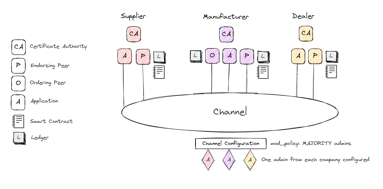
In this article, we will talk about Hyperledger ...
Learn More

The Metaverse audience can consist of tech ...
Learn More

Summary As a developer, it’s common to download ...
Learn More

Introduction Lately, Foundational AI models, and ...
Learn More

In recent years, the rapid advancement of ...
Learn More